The community of content creators on YouTube is growing increasingly, and each channel must have a differentiating factor. A logo of a YouTube channel helps to get recognition among the audience. Luckily, thanks to tools such as Wix’s free logo maker, you don’t need to be an experienced graphic designer to create a logo that matches your brand’s image and identity.
So, If you’re looking for YouTube Channel logos, this blog post will showcase the 7 best Abstract Logos for YouTube Channels that you can use. Some of the best Abstract Logos for YouTube Channel are PiewDiePie, iiSuperwomanii, Dude Perfect, ErikTheElectric, etc.
Each of these logos is unique and represents the essence of each content creator. We hope you will find this blog post helpful in creating a logo that accurately represents your Youtube channel’s brand and identity. So, Let’s start exploring Abstract Logos for YouTube Channel!
Table of Contents
Abstract Logo Marks
Abstract trademarks are pretty potent for businesses looking to convey a sense of creativity and innovation. An abstract mark is a form of a pictorial logo that doesn’t represent anything in particular. It’s not an identifiable image, such as an apple or a bird; instead, it’s an abstract geometric shape representing your company.
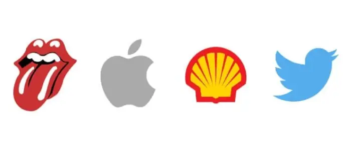
Abstract logos are designed to communicate deep meaning and emotion using only one symbol. This makes them ideal for brands with much to say or companies whose identity isn’t easily conveyed through a recognizable image. While a wordmark or organic image might be more recognizable, the right mix of lines, colors, and shapes can create a more robust emotional response.
Read More: 9 Methods to Fix YouTube Videos Loading but not Playing Error
Why do People Need a Logo for their YouTube Channels?
A logo is essential for any brand, including content creators.
The benefits that a logo brings to your Youtube channel are:
- A channel logo is the first step towards establishing your channel’s identity on Youtube.
- A logo for your Youtube channel gives it a professional look and establishes trust.
- The YouTube channel’s logo helps the owner feel legitimate.
- You may have powerful branding with a YouTube channel logo.
- It helps in increasing the ability to identify and recognize people.
Read Also: [Solved] How to Fix YouTube Comment Failed to Post
Why are Abstract Logos Great for YouTube Channels?
A tremendous abstract logo is essential for any brand but can be especially important for Youtube channels. After all, in most cases, a logo is the first thing that audiences see when they visit your channel, and it helps you create a lasting impression on the viewers. Abstract logos are particularly well-suited to YouTube channels for numerous reasons.

Firstly, they are highly adaptable and can be easily resized or reformatted to fit any space. Secondly, they are often more eye-catching than realistic logos, making them ideal for small spaces like channel icons. Finally, abstract logos can be highly memorable, helping viewers to recall a channel when they see it again quickly. Whether you’re just starting on Youtube or looking to rebrand your channel, an abstract logo could be the perfect solution.
For those seeking a hassle-free solution to design their abstract logo, check out Turbologo. This user-friendly platform empowers content creators to craft unique and visually appealing logos effortlessly.
Examples of Some Great Abstract Logos for a YouTube Channel
A few things might come to mind when considering abstract logos for your YouTube Channel. Perhaps you think of a simple and memorable logo that can be easily recognized even when seen out of context. Or maybe you think of a logo full of hidden meaning that reveals new layers of complexity the more you look at it. Whatever your definition, there are plenty of examples of great abstract logos for YouTube channels.
Know More: How To Go Viral On Instagram? | 10 Best Ways You Can Try
PiewDiePie
Have you heard of Felix Arvid Ulf Kjellberg’s personality? You probably know him best from his vlog, PewDiePie, which has 64 million subscribers on YouTube.
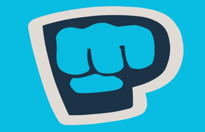
The logo for YouTube’s most famous star, PewDiePie, is distinctive and unique. It isn’t something boring or casual. The logo for “PewDiePie” depicts the character’s name, in which the letter “P” is replaced with a fist. The sound of throwing a punch, known as the “Pew,” came into use while creating this logo.
The channel’s logo is an excellent example of being both relatable and informative. It gives viewers enough information to know what they can expect from the channel: gaming content that is also fun to watch.
iiSuperwomanii
Lily Singh is the star of her show. Her personality, which can be described as bubbly and charming, engages viewers and keeps them coming back for more content that is always interesting. “iisuperwomanii” first appeared on YouTube in 2013 but has since come to be known simply as “superwoman.” Since starting her YouTube career, her channel has gained over 15 million followers. Many people love her comedic sketches and relatable content, sometimes featuring celebrities or influencers.
The logo of Superwoman resembles that of DC’s Superman, and considering the name, and consumers may anticipate a strong logo depicting a superhero. In reality, it is the complete opposite; breaking stereotypes. The pastel colors of the rainbow in the background represent Lily’s interests and personality.
Dude Perfect
This American channel, which has over 54 million followers, is a part of the sports and humor group based in Texas. The group comprises three sets of twins who used to live together when they attended Texas A&M University. The channel aims to provide a wealth of pure entertainment to its audience.
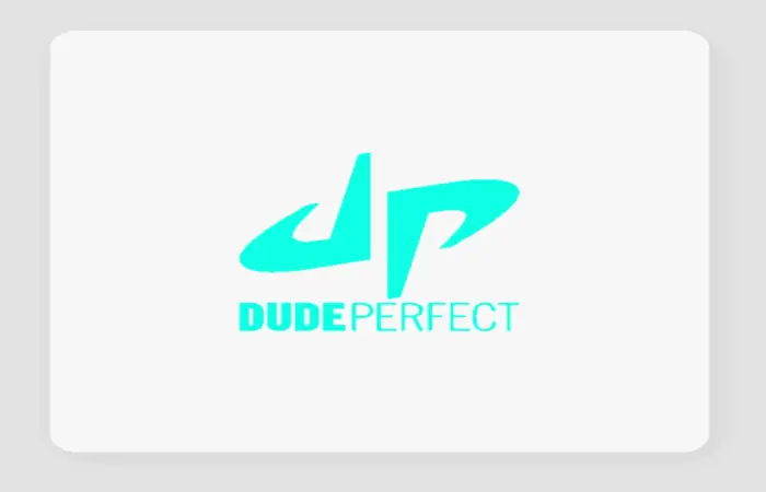
The channel’s name, “Dude Perfect,” comprises the two initials “DP.” This is a good idea for a comedy sports network regarding brand identification. The typeface appears to be very laid-back and casual, almost like something you would doodle on the back of your notebook, which is understandable given that they were all once college students.
See Also: Convert YouTube Video To WAV File {Updated}
Don’t know How to Download YouTube Playlist? Click Here to learn how to do it.
ErikTheElectric
It’s a youtube channel with 1.93 million subscribers. The content of this channel is basically a guy with a huge appetite who can eat large amounts of food and makes food challenges. He also does other types of videos, but eating challenges are the most popular.
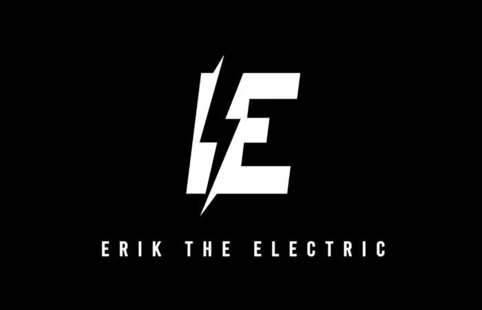
The logo for this channel is a very simple one. It just shows the name of the channel in a black-and-white font. The letter E makes it look like it’s been electrocuted, which is a clever reference to the channel’s name.
Check this out: Fix YouTube Black Screen on Google Chrome – 10 Effective Ways
Backyard Scientist
This YouTube channel has over 7 million subscribers and is all about performing science experiments. As the name suggests, the Backyard Scientist does many of his experiments in his backyard.
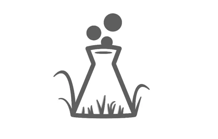
The logo of this channel represents a flask alluding to scientific content and bubbles indicating chemistry and experiments. In addition, the grass at the end of the flask represents the garden, which alludes to the name.
Blogilates
In 2009, Cassey Ho created a Blogilates channel to upload fitness videos. The channel has over 7 million subscribers and offers a variety of workout videos, as well as healthy recipes and tips.
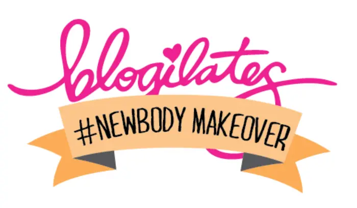
The logo for this channel is straightforward but effective. It consists of the word “Blogilates” written in pink font. The letter B looks like a heart and combines the letter in it. This color scheme represents the two main topics of the channel: fitness and health. This is an example of how you can mix your youtube channel logo with your website logo.
Read Also: 10 Innovative Graphic Design Business Ideas You Can Use in 2022
The Try Guys
Lastly, Try Guys is a YouTube channel with over 6 million subscribers. BuzzFeed owns this channel and features a group of four friends who try out various activities, usually with hilarious results.
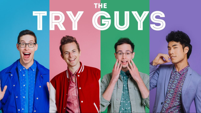
The logo for this channel is the silhouette of a triceratops in pastel colors: pink, purple, green, and blue. This is likely a reference to the group’s name, as the word “try” can be associated with taking risks. Lastly, The pastel colors are also playful and lighthearted, which matches the tone of the content on the channel.
FAQS
How can I create an abstract logo for my YouTube channel?
Creating an abstract logo for your YouTube channel involves brainstorming and sketching ideas. Identify critical elements or concepts representing your channel, experiment with shapes, colors, and compositions, and refine your design through iterations. Use graphic design software or hire a professional designer to bring your concept to life.
Can abstract logos be used in combination with text for my YouTube channel?
Abstract logos can be combine with text to create a comprehensive visual identity for your YouTube channel. Incorporating your channel's name or initials alongside the abstract logo can reinforce brand recognition and make it easier for viewers to associate the logo with your content.
How do I ensure that my abstract logo suits my YouTube channel's niche?
To ensure your abstract logo aligns with your YouTube channel's niche, consider the visual language and symbolism associated with your content. Research industry trends, analyze competitors' logos, and aim for a design that reflects the essence of your channel's niche while still maintaining a unique and visually appealing aesthetic.
How can I make my abstract logo memorable?
To make your abstract logo memorable, focus on creating a simple, unique, and visually striking design. Aim for a balance between simplicity and complexity, using shapes, colors, and lines that are visually intriguing without being overwhelming. Test your logo on different scales and mediums to ensure it remains impactful and recognizable.
Can I modify my abstract logo in the future?
Yes, you can modify your abstract logo in the future if needed. However, it's essential to maintain some consistency to preserve brand recognition. If you plan to make changes, ensure the modifications align with your channel's evolving brand identity and support the core elements that make the logo recognizable to your audience.
Conclusion
There are many great examples of Abstract Logos for YouTube channels. These logos are often simple and eye-catching, with a design that is easy to remember. Abstract logos can be an excellent choice for a YouTube channel, helping to make it more recognizable and memorable.
Lastly, consider using a simple and eye-catching design that is easy to remember while creating your logo. Then, use pop colors, and try to incorporate geometric shapes or other visual elements to help your logo stand out. And finally, don’t forget to ensure your logo accurately reflects the tone and content of your channel. With a great logo, you’re well on your way to success on YouTube!
Suggested for you: 12 Best YouTube Channel Name Generator Tools